

After making their debut last year at the All-Star Game here in Seattle, the MLB has fully rolled out their new jersey template for all 30 clubs at this year’s spring training. The response from players and fans alike has been rough, with both groups expressing their displeasure with Nike and Fanatics for the way the jerseys have been crafted.
The new template spent years in development before the rollout for the All-Star Game, with its biggest change being the material of the jersey. Nike dubbed the new, lightweight material “Nike Vapor Premier,” describing that the material’s “breathable, lightweight, high-performance fabric is made from at least 90% recycled polyester yarns. It also gives the jersey 25% more stretch and allows it to dry 28% faster, with moisture-wicking Dri-Fit ADV technology keeping players cool. Nike body-scanned more than 300 baseball players to find the ideal fit, which is more athletic and form-fitting than previous models.”
The jersey was designed to be lighter and help the players be more athletic, reducing the extra fabric found on MLB’s old Majestic template. The All-Star jerseys seemed to look normal, with nothing too out of the ordinary sparking debate on social media. Fans then mostly forgot about the new template, as regular action resumed.
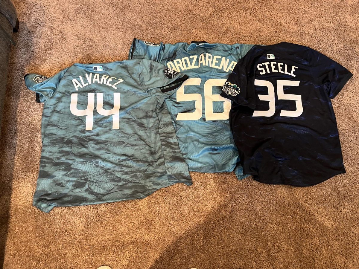
That was until spring training this year, when players discovered the major changes to their jerseys. The biggest change was the size of the jersey font, which was significantly more compact and harder to read. This change sparked outrage among fans and players, with a fan posting a screenshot on X of Seattle Mariner Michael Chavis’ Instagram story of his new jersey, before receiving a response from Fanatics about the jersey not looking right.
Besides the lettering, one of the other major changes came in the jersey patches and stitching. Names across the front of the jersey looked off thanks to Nike’s new template, and sleeve patches were switched from stitched on to ironed on, giving the jerseys a cheap look.
Many fans have chosen not to purchase the new jerseys thanks to the changes, with some GP students opting not to spend until the jersey quality increases. “I think [the MLB] really messed up on the uniforms. The fonts are all messed up and are really undersized, and don’t even get me started on the see-through pants, those are terrible,” Julian Cruz said.
Cruz isn’t the only fan to be disappointed, as many fans have compared the quality of the jerseys to those of ones given away by teams on giveaway days. “[The jerseys] look like the shirt jerseys that you see little kids wearing. I really hope they change them by the time the season starts,” Angus Van Valey said.
With the league locked into a deal with Nike and Fanatics for another six years, it’s unlikely that the sportswear giant will make any major changes to its template for the time being, though fans hope they’ll listen to the feedback of the people spending the money.